Open main menu
Summary of Internship
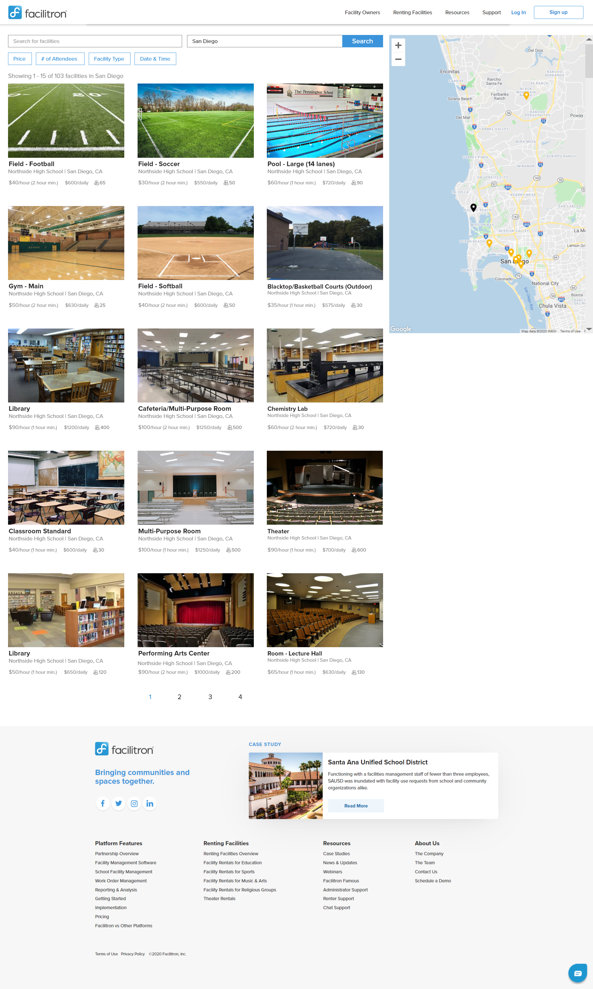
The Objective: Users should be able to seemlessly navigate through the data base of school districts, schools sites, and available facilities. A smooth user path would allow renters to locate and book facilities with ease, potentially increasing the amount of rentals and therefore increasing the companies return on invenstment.

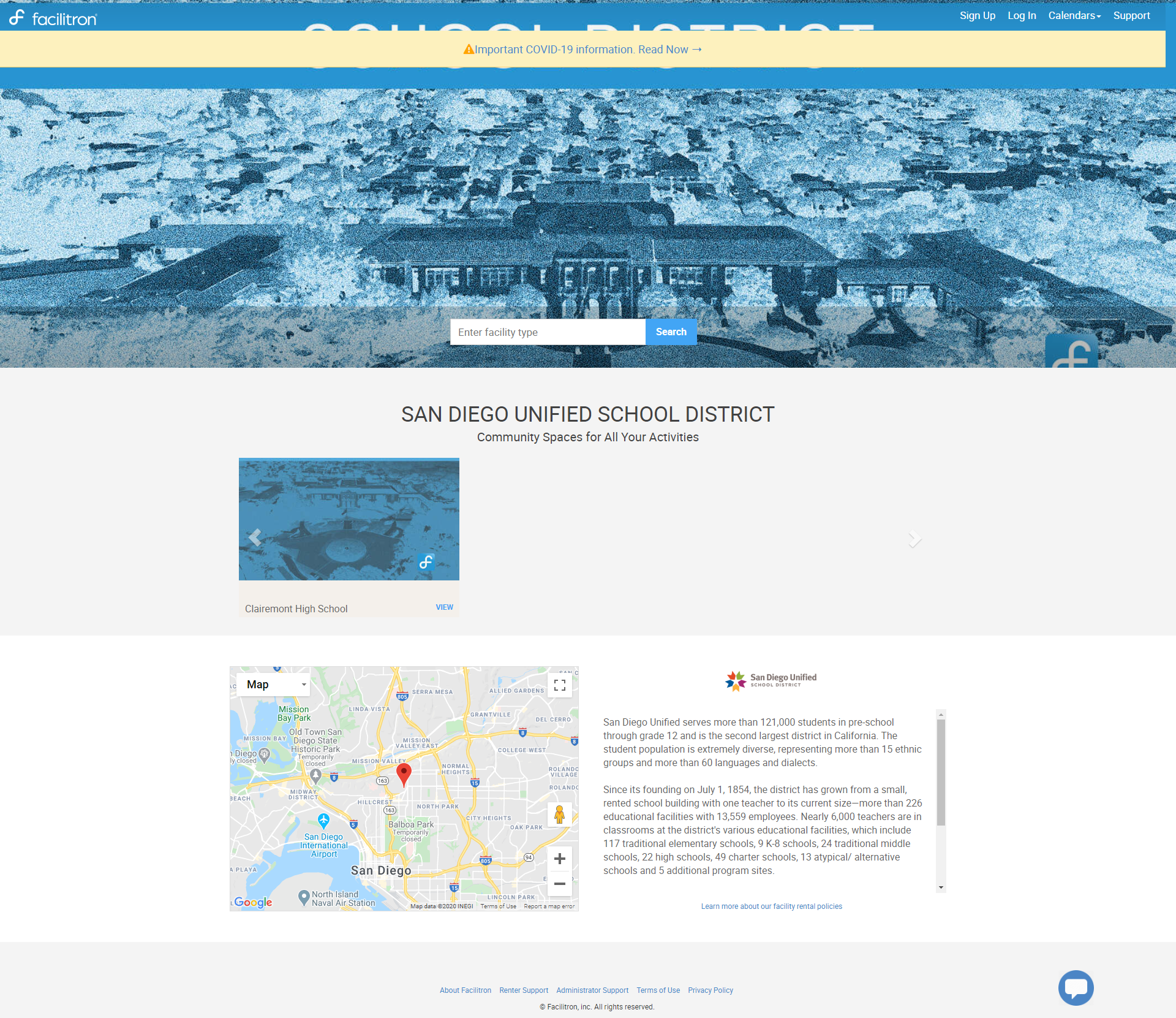
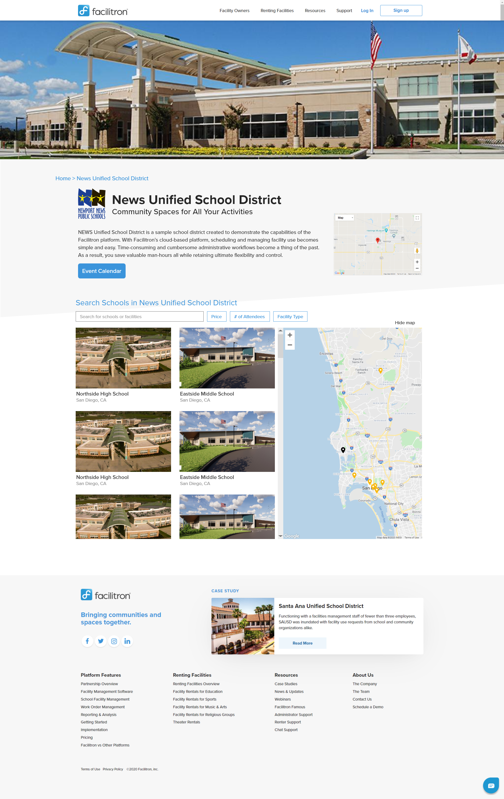
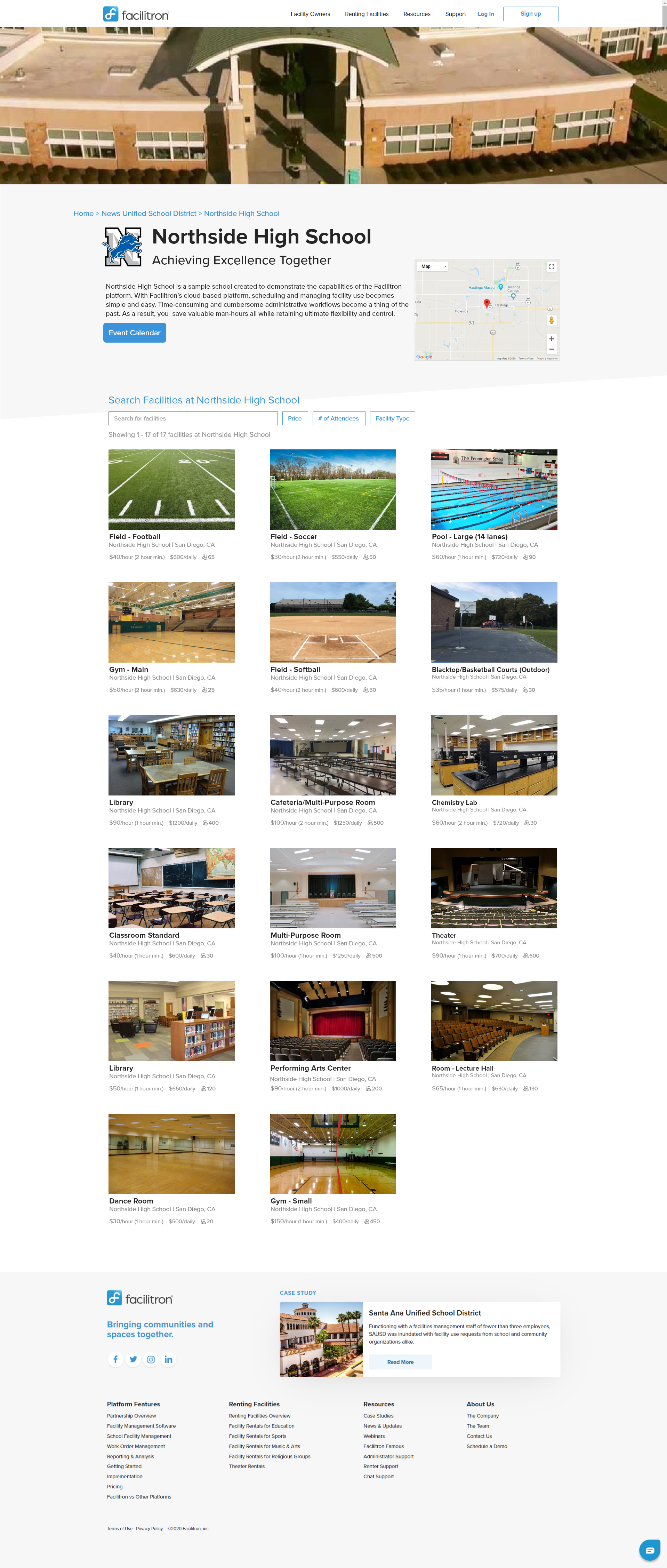
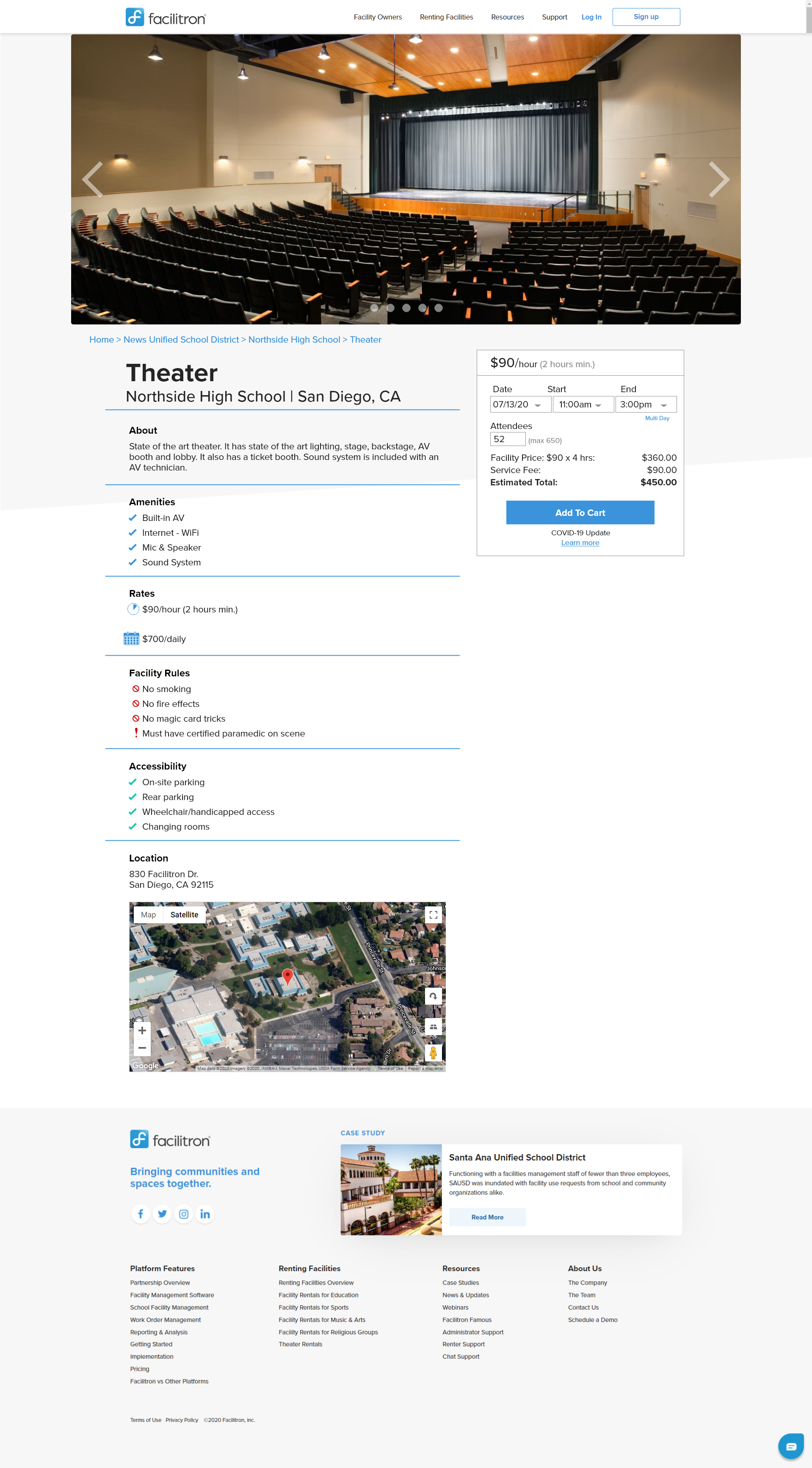
My Task: Facilitron had put togehter a rough draft of what they would like their deistrict pages to look like. Users would be able to navigate from the district pagem to the school's page, and ultimately find the facility they are looking to rent. I was tasked to redesign the district, school site, and facility pages as well as the final checkout page. My goal was to create a strong consitentcy in style and have clear brand identity thoughout. I also wanted to make the checkout process simple and quick to increade the likelyhood of renters booking facilities.

Role: UX Researcher, UI Designer
Tools: Adobe XD
Time: 6 weeks

Research Data
My reseach showed the current site map for Facilitron was clunky, dull, and did not represent Facilitron the same way their live site did. Similar companies and services had clean layouts with an easy to navigate site and made the checkout process quick and easy for users. Many competitiors showed the facility details (such as pictures, price breakdown, and otional add ons) on the checkout page, reminding renters what exactly they are paying for and what they will be getting.

Competitor Analysis
After researching our competitors, I learned...

  • Pictures of the location/facility are the top priority for users
  • The ability to search from a map or a list allows for differnt search options
  • The checkout process should idealy be one page, having users complete required fields as they scroll
  • Search maps should automatically researches when the location is moved
  • Cost per hour (or daily cost) should be displayed with the images for a quicker search

Facilitron's Rough Draft


My Hi-Fi Web Solution